3. Example Analysis
Once you have a conda environment set up and some basic packages installed, you can begin to create notebooks and carry out analysis.
Python
The package xarray includes a number of example datasets that can be used to get used to
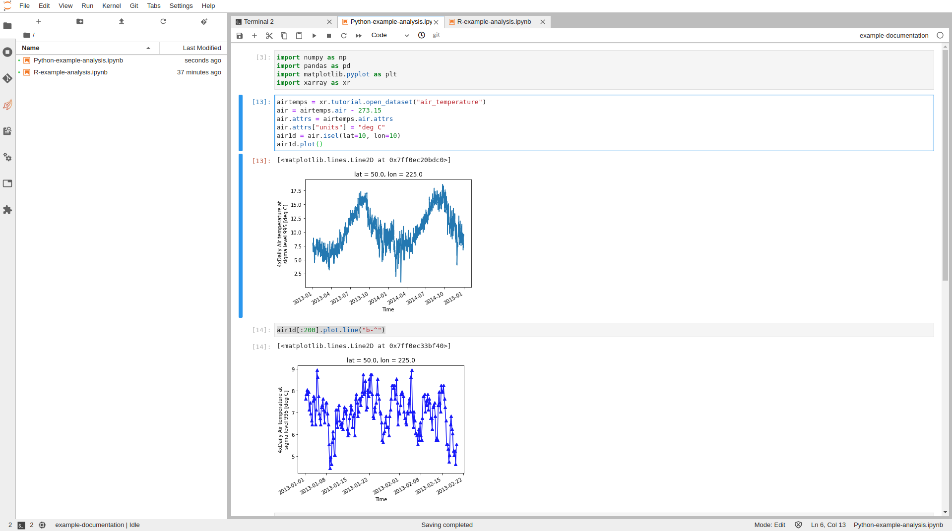
analysis in Jupyter, below shows a basic example for a simple plot around air temperature.
Paste this code into a Jupyter cell of a python notebook and run the contents (make sure that you have installed the packages in the previous section).
import numpy as np
import pandas as pd
import matplotlib.pyplot as plt
import xarray as xr
# Open air temperature dataset
airtemps = xr.tutorial.open_dataset("air_temperature")
air = airtemps.air - 273.15
air.attrs = airtemps.air.attrs
air.attrs["units"] = "deg C"
air1d = air.isel(lat=10, lon=10)
air1d.plot()
air1d[:200].plot.line("b-^")

R
The package nycflights13 contains data relating to flights from a US airport and can be used
to get used to handling data within R.
Past the code below into a cell of an R notebook and run the contents (ensure that the packages in the previous section were installed first)
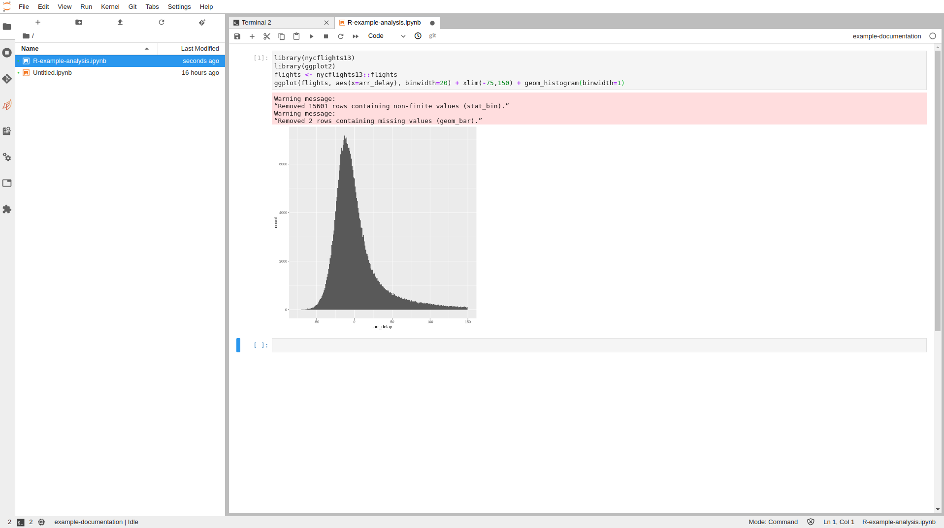
The below simply plots a histogram of the time difference with arrival (negative is early), it represents something looking like a normal distribution.
library(nycflights13)
library(ggplot2)
flights <- nycflights13::flights
ggplot(flights, aes(x=arr_delay), binwidth=20) + xlim(-75,150) + geom_histogram(binwidth=1)

There are a number of very good tutorials
which make use of the nycflights13 dataset and help you get started with using a wide arrayy
of useful packages and techniques.