3. Example Analysis
Once you have a project set up and some basic packages installed, you can begin
to create R files and carry out analysis. A good place to start is simply
visualizing some data. The nycflights13 package contains some good example
data relating to flights from a US airport.
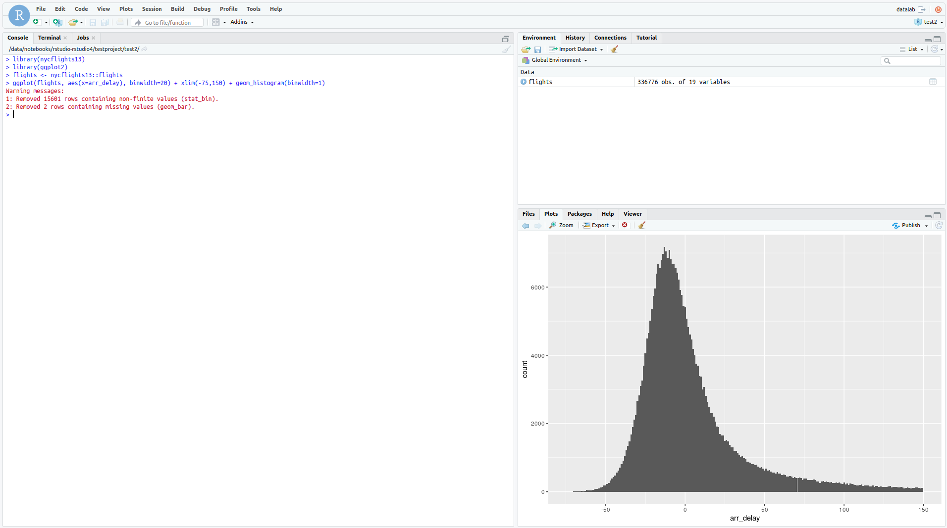
Paste the code below into an R notebook and run it. It simply plots a histogram of the time difference with arrival (negative is early), it represents something looking like a normal distribution.
library(nycflights13)
library(ggplot2)
flights <- nycflights13::flights
ggplot(flights, aes(x=arr_delay), binwidth=20) + xlim(-75,150) + geom_histogram(binwidth=1)

There are a number of very good tutorials
which make use of the nycflights13 dataset and help you get started with using a wide arrayy
of useful packages and techniques.